This is Part 2 of our series on Noodle Intranet Theme Design. To view “Part 1” please click here.
Recently, Noodle Intranet, was updated with more options for the Top Navigation view and a fresh new style. This makes the Top Navigation view more customizable than ever before. The Top Navigation menu has also been improved to open “on click”, rather than on “hover” which could get in the way sometimes when navigating the site the old way. This helps improve the user experience and makes it better for administrators as well.
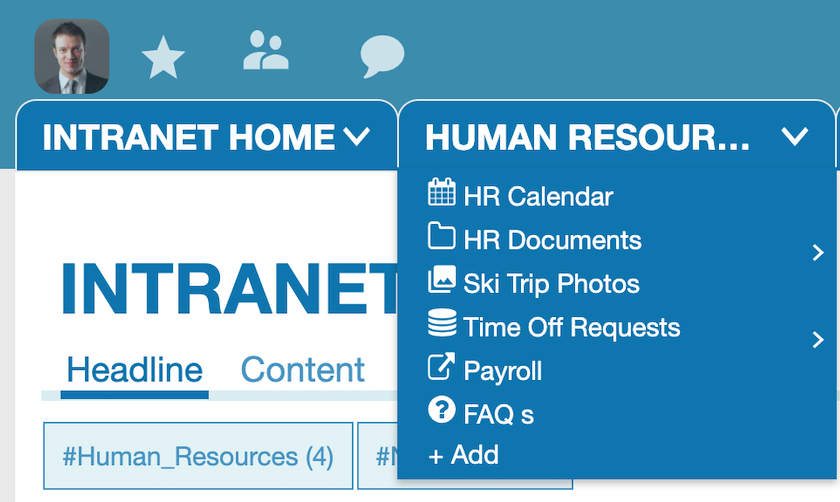
Top Navigation Customization
There are now 4 options to control the look of your navigation.
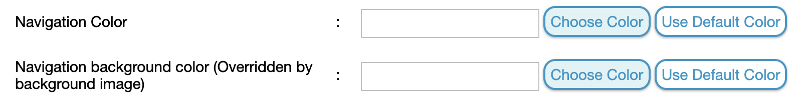
The new “Navigation Color” and “Navigation Background Color” allow you to customize the text links in the Tabs, and the background of the Tabs. You can try different combinations and will be able to set individual colors for tabs in the future as well.
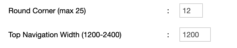
Setting the Navigation Width also helps you get the most out of your screen space. Companies that use wider monitors/screens may want to use a wider view to fit more content on their screen and have less wasted space.
This also helps keep the Section Tabs at the top organized.
You can also control the shape of the Tabs at the top by setting a value for “Round Corner”. This allows you to have rectangular tabs, or have them more curved and rounded. Note that this also changes the shape of your Widget boxes.
There are still other possibilities customizing your navigation using the built-in CSS box in the Theme options. You are able to go beyond the buil-in options to style Noodle any way you want.
Please send us any questions or feedback you may have. If you are not using Noodle yet, feel free to sign up for a free demonstration of our software.