Jakob Nielsen, PhD is the universal expert on web usability. Here are some of the many titles bestown upon him: “king of usability,” “guru of web page usability,” “smartest person on the web,” and “the web’s usability czar.”
So when Nielsen tells us that the following are the 10 general principles to achieve the highest usability on the web, we listen. Below are Nielsen’s usability guidelines, and how we can apply them to make the company intranet more useful and effective.
Nielsen’s 10 Usability Heuristics for User Interface Design
“Visibility of system status
The system should always keep users informed about what is going on, through appropriate feedback within reasonable time.”
Users should always know where they are in the intranet, and what they can do there. Breadcrumbs, for example, can help users keep track of their intranet location, especially when they’ve wandered into deep pages.
“Match between system and the real world
The system should speak the users’ language, with words, phrases and concepts familiar to the user, rather than system-oriented terms. Follow real-world conventions, making information appear in a natural and logical order.”
Pay attention to the labels you use for intranet sections, folders, and applications. Staff shouldn’t have to learn new terminology to use the intranet.
“User control and freedom
Users often choose system functions by mistake and will need a clearly marked “emergency exit” to leave the unwanted state without having to go through an extended dialogue. Support undo and redo.”
Undo, Redo, Close, Back buttons. Enough said.
“Consistency and standards
Users should not have to wonder whether different words, situations, or actions mean the same thing. Follow platform conventions.”
Consistency should also be applied to the aesthetics of the intranet. Don’t use too many different fonts, styles, and colors. And maintain consistency throughout different types of intranet content.
“Error prevention
Even better than good error messages is a careful design which prevents a problem from occurring in the first place. Either eliminate error-prone conditions or check for them and present users with a confirmation option before they commit to the action.”
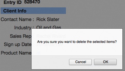
Providing step-by-step instructions and asking for confirmation before deleting items are examples of how errors can be prevented.
“Recognition rather than recall
Minimize the user’s memory load by making objects, actions, and options visible. The user should not have to remember information from one part of the dialogue to another. Instructions for use of the system should be visible or easily retrievable whenever appropriate.”
Always provide instructions and context to the intranet user’s actions.
“Flexibility and efficiency of use
Accelerators — unseen by the novice user — may often speed up the interaction for the expert user such that the system can cater to both inexperienced and experienced users. Allow users to tailor frequent actions.”
Customizable views, shortcuts, and personalized links are possible accelerators for more advanced intranet users.
“Aesthetic and minimalist design
Dialogues should not contain information which is irrelevant or rarely needed. Every extra unit of information in a dialogue competes with the relevant units of information and diminishes their relative visibility.”
Remove unnecessary elements, keep text concise, and make the intranet visually clean.
“Help users recognize, diagnose, and recover from errors
Error messages should be expressed in plain language (no codes), precisely indicate the problem, and constructively suggest a solution.”
Give feedback when users attempt to complete a process in the intranet but make mistakes that result in errors.
“Help and documentation
Even though it is better if the system can be used without documentation, it may be necessary to provide help and documentation. Any such information should be easy to search, focused on the user’s task, list concrete steps to be carried out, and not be too large.”
We aim for intranets that are so intuitive, users can hit the ground running without sitting in training sessions or poring through manuals. But if all else fails, help and documentation should be available.
Does this list give you ideas for improving the usability of your intranet? Which ones?