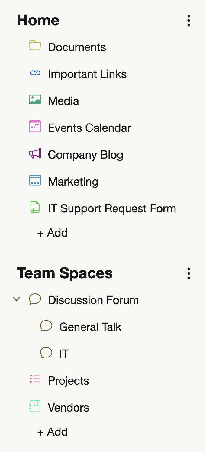
With Noodle, we’re committed to making intranet software that’s intuitive, efficient, and enjoyable to use. One of the subtle but powerful design choices we’ve made is using color-coded icons for applications within the navigation menu.

You might be wondering: why not just stick to a simple monochrome interface? The answer lies in usability, user experience, and visual cognition. Here’s why we believe color-coded icons make a big difference for your organization.
1. Faster Recognition = Greater Efficiency
Colors act as visual landmarks. By assigning each application its own color, users can quickly associate a task or tool with a specific visual cue. Instead of scanning through text labels or identical icons, the brain processes color and shape almost instantly—saving time and reducing friction in daily workflows.
For example: A red icon for “HR Requests” or a green one for “Project Tracker” helps users jump to what they need with minimal thought.
2. Improved User Onboarding and Navigation
New users can feel overwhelmed by unfamiliar tools. Color-coded icons make Noodle’s navigation more approachable by giving users quick visual reference points. They don’t need to memorize where everything is—their brain does some of the work for them.
It’s especially helpful in hybrid or large organizations where different departments rely on different applications. The consistent use of colors allows users to form habits and muscle memory faster.
3. Visual Separation of Functions
Not every application is created equal. Some are meant for communication, some for documentation, others for workflow management. Color-coding subtly reinforces these differences without cluttering the interface.
This visual separation makes it easier for teams to organize their workspaces and prioritize key tools—especially in environments with a high number of apps.
4. Better Accessibility and Inclusivity
Noodle’s color-coded system isn’t just about aesthetics—it’s designed with accessibility in mind. We’ve carefully chosen our color palette to maintain contrast and clarity for users with visual impairments or color blindness. And because color is paired with iconography, users have redundant cues to navigate with confidence.
5. A More Engaging Experience
Let’s be honest—using software all day can get dull. A bit of color adds vibrancy and personality to your digital workspace. Color-coded icons give Noodle’s UI a sense of playfulness and energy, which contributes to higher user engagement and satisfaction.
In Summary
Color-coded icons aren’t just a design choice—they’re a usability feature. They help teams navigate faster, reduce training time, support accessibility, and make the whole intranet experience more enjoyable.
At Noodle, it’s these small design details that add up to a better, smarter intranet.
Try it out yourself—start your free trial and see the difference.